
Introduction
Any product or service that involves setup, customization or maintenance thrives with detailed user documentation. This includes guides with step-by-step instructions and troubleshooting tips. Without clear guidance, people must figure things out through trial and error, leading to frustration.
But creating user documentation is no easy task—it requires structure, foresight and the ability to answer complex questions effectively. Some considerations include:
- What format will your user documentation take? Should it be a printed training manual or an online knowledge base?
- What tone and writing styles should you use to draft the documentation?
- Which topics need dedicated troubleshooting guides or step-by-step instructions?
- How technical should your user guides be?
As you dive into your documentation project, you’ll face these questions and more. This article is here to give you the tools to answer them. We'll start by clarifying the purpose of user documentation and the key benefits you aim to achieve, helping you optimize your approach. Then, we’ll showcase standout user documentation examples and share best practices to guide you in creating your own.
What’s User Documentation?
User documentation consists of helpful materials like training guides, instructions and operations manuals to help users get the most out of a product. You’ve probably used such materials many times when starting with a new service or troubleshooting a technical problem. If you’ve ever been frustrated with poorly-written instructions, you know how important it is to get user documentation right.
User documentation is always written for a product’s end user. Other types of documentation, like technical and software docs, give technicians or developers necessary specifications to do their work. Because user documentation is meant for consumers, it’s written in plain language without the jargon that other documents might include.


What Are the Benefits of User Documentation?
Writing comprehensive user documentation, whether it’s printed into a user manual or published in an online knowledge base, affords the following benefits.
Lower Customer Support Costs
Features like a table of contents and a search functionality make it easy for customers to find answers to their questions. This means they don’t have to rely on customer support for help, which leads to reduced costs and resources for your company.
Saved Set-up Time
Setting up a product or service takes significantly longer without step-by-step instructions leading you through the process. That’s because there might be many ways you could go about it. User documentation outlines the most efficient path from beginning to end, saving frustrating trial and error cycles.
Increased Customer Retention
Well-written documentation provides instructions, user guides and troubleshooting tips that improve the entire user experience (UX). A quick start guide, for example, propels users through the onboarding process quickly, and an online knowledge base can guide them through extending the product's functionality with plugins and integrations. Without all this documentation, customers might abandon your product after getting frustrated trying to figure things out independently.
5 User Documentation Examples
Here are five examples of exceptionally well-written user documentation, including knowledge bases, user guides and instruction manuals.
1. Scribe
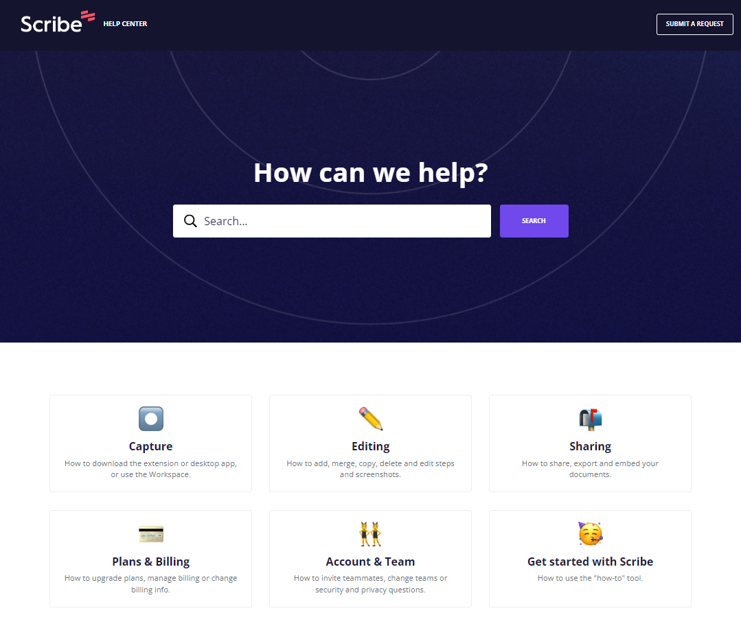
The Scribe Help Center is an example of an online knowledge base where users can learn how to work with the product and find answers to questions about their accounts. The center includes six main categories, each containing multiple subtopics people might want to learn about. Or they can use the search bar at the top of the page to quickly find a guide about a specific topic.
Because we used Scribe to create the documentation in the knowledge hub, it features screenshots, step-by-step instructions and plain language, making each document easier to follow. Scribe makes it easy to generate instructions seamlessly, so writing it is much faster than with traditional methods.
2. Stripe Docs
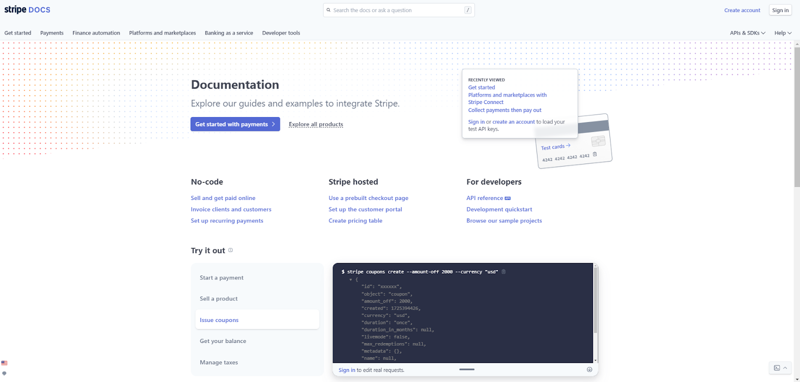
Stripe is a platform businesses use to handle payments and protect customer data. They face a unique challenge because, while the documentation is meant to help end users, the setup is quite technical. People must learn how to set up their accounts, migrate their customers’ data and build a payment form, all of which require some know-how.
To overcome these obstacles, Stripe created documentation for every level of technical knowledge. There are guides to avoid writing code, others that leverage pre-built templates and advanced instructions for setting everything up from scratch.
3. Webflow University

Webflow is a web design platform built for beginners and seasoned veterans alike. Webflow University offers comprehensive user guides and lessons that explain their product’s tools and features. It’s all categorized according to primary topics like “Layout & Design,” “Interactions & Animations” and “Accessibility.”
Each course and document features screenshots and clear instructions, and some even have interactive modules that guide people through the more advanced tools. There’s also a Webflow Forum where users can ask each other questions and suggest features for future updates. These platforms form a self-service ecosystem where customers can find answers, help each other troubleshoot and provide feedback about the service.
4. KiwiCo
KiwiCo is a subscription service that sends kids fun crafting projects in a crate that ships monthly. They have a useful help center where parents can find answers about shipping policies and safety regulations, but the real star of the show is the instruction manual for each crate.
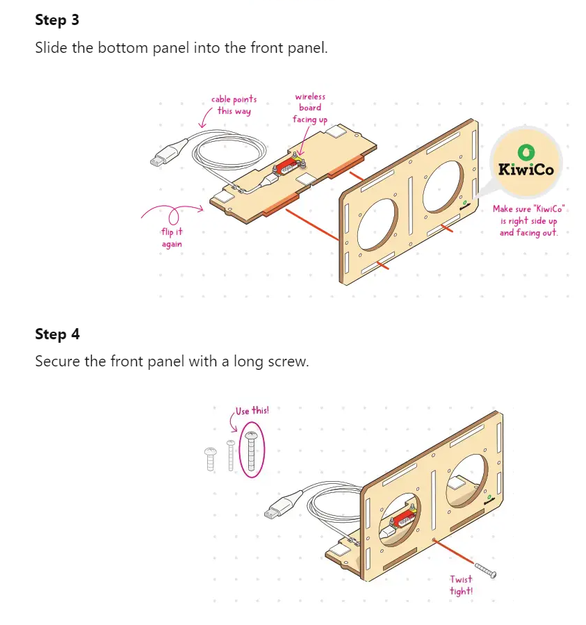
KiwiCo’s extremely well-written instruction manuals demonstrate how well the brand knows their target audience. Notice how the arrows and lines clearly indicate what the text is describing and call out which direction each part should face. Every step in their instructions is this detailed, so energetic kids and bumbling parents alike can assemble these crafts without frustration.
5. AdRoll
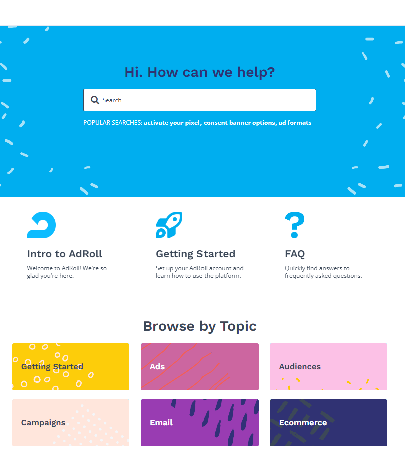
AdRoll is a brand management platform that lets users customize their advertising across multiple channels simultaneously. Their help center is a comprehensive knowledge base that details everything from customizing your color palette to uploading your logos.
They organized everything into primary categories for easy differentiation, and they divided the comprehensive onboarding documentation into sections titled “Intro to AdRoll” and “Getting Started.” This makes onboarding less overwhelming than it could be with all that information in one place. Furthermore, every document uses screenshots, a sticky table of contents and numerous links that keep all the user guides interconnected.
4 Best Practices for Writing Great User Documentation
Here are four big-picture best practices that’ll help you write great user documentation. As you read these, consider how the writers of the above examples followed similar principles to create their documentation.
1. Research Your Users
Before you create any documentation, your first goal is to understand the users you’re writing for. Your audience determines your writing tone and how technical you can make the guide. For example, KiwiCo products are for kids, so every instruction manual is written with an encouraging tone and a specific reading level in mind.
2. Use Plain Language
Writing in plain language keeps your documentation accessible, actionable and concise. Sometimes, simplicity is the hardest thing to get right, but you can follow some tips that help. George Orwell created six rules for great writing, all of which are widely applicable, but these three in particular will help you keep your writing plain and readable:
- “Never use a long word where a short one will do.”
- “If it is possible to cut a word out, always cut it out.”
- “Never use a foreign phrase, a scientific word, or a jargon word if you can think of an everyday English equivalent.”
3. Keep Documentation Updated
Your product will likely evolve over the years, and it’s crucial that you keep your documentation updated. If customers try to use an outdated guide to troubleshoot an issue, they’ll probably have a poor experience. That’s why tools like Document360 and Scribe are so valuable. Scribe, for instance, makes it easy to update your documents so that your screenshots and instructions accurately represent the product’s current UX.
Write Better User Documentation With Scribe
Comprehensive user documentation educates people about your product and helps them get the most out of it. Good documentation also lowers your support costs, saves customers’ time and encourages them to stick around.
Writing documentation is a big undertaking, but a tool like Scribe can help. Simply turn on the desktop app or browser extension, complete your process as usual and let Scribe capture every click and scroll to create an accurate guide. The tool will add visual elements and collaborate in real time to produce clear and engaging user documentation.
Sign up for free today to try it out for yourself.


