
Introduction
Your customers don’t have the time to write long emails or wait for hours to speak with a customer support executive. They need quick, on-demand help whenever and wherever they get stuck.
Wondering what’s the easiest way to deliver just-in-time support to your customers?
Two words: FAQ pages.
An FAQ page curates a list of the most commonly asked questions and offers quick solutions. These pages are critical for creating a self-serve experience where customers can troubleshoot issues and find answers on their own.
FAQ pages can range from standalone pages to full-blown help centers. In this article, I’ll break down the best ways to find questions for your FAQ pages with actionable tips + examples showing how to write FAQs.
TL;DR: How to write a FAQ page
- Frequently asked question pages provide quick, on-demand help for customers.
- They boost customer satisfaction, save time for the support team, and deepen product adoption.
- To create an effective FAQ page, analyze support tickets, monitor social media mentions, and sync with your support team.
- Structure your FAQ section logically, write clear and concise answers, and focus on solutions.
- Use visuals and multimedia to engage users and maximize information retention.


What is an FAQ page?
An FAQ page is a collection of the most commonly asked questions related to your product or service. This page is typically part of a broader knowledge base with several questions curated for different topics or categories. But you can also create a standalone FAQ page or add a section within a landing page to answer these common questions.
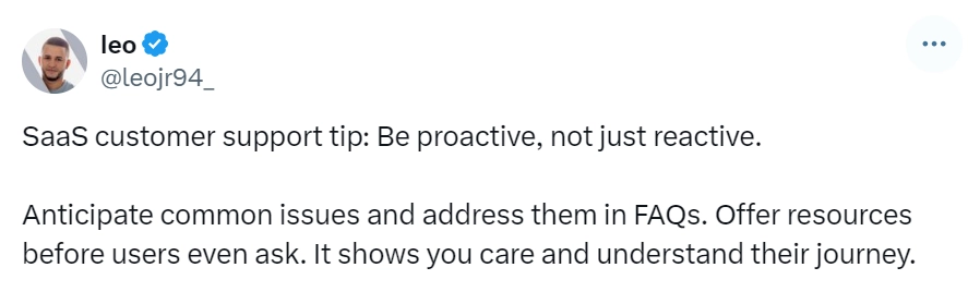
Answering FAQs is critical for SaaS businesses since it can eliminate friction in the user experience. Leo, the founder of IndexWhale, highlights how FAQs help product teams stay one step ahead of their users and deliver a seamless experience.
Wondering whether creating an FAQ page (or a help center) is even worth all the hassle? Here are six reasons why you should invest in one:
- Boost customer satisfaction: An obvious advantage of creating a self-serve help center or FAQ page is the seamless experience you deliver to customers. Instead of asking them to go through inconvenient steps, effective FAQ pages provide direct and quick solutions.
- Deliver round-the-clock help: We get it—your support team can’t work 24/7. That’s why you need an FAQ page to answer user queries even when your team is offline. You can cater to users across multiple time zones without hiring a dedicated support team for each region.
- Deepen product adoption: When users can instantly troubleshoot issues or find answers, they can become proficient and get more value out of your product. So, a successful FAQ page works well in the large scheme of things to drive product adoption and create power users.
- Save time for the support team: Good FAQ pages also save your customer service team the struggle of answering the same questions over and over again. Besides, when customers can solve problems independently, they won’t need to rely on support reps for every minor task.
All things considered, creating FAQ pages is a win-win for your users and support team alike. So, let’s dig deeper into how you can design user-friendly frequently asked question pages and deliver a self-service experience.
What are basic FAQ questions?
FAQs are a set of general questions and answers that are not tailored to a particular product or service.
Common questions and answers include payment methods, customer support contact details, and refund procedures.
How to find FAQs for self-service customer support
FAQs are a collection of the most commonly asked questions about a product or service. Basic questions and answers provide all essential details about your offering—like subscription price, billing, features and more.
Now, the million-dollar question is: how do you find the right questions for your customers?
Here are a few tried-and-tested tactics to find frequently asked questions for a self-service experience:
- Analyze customer service data and support tickets: One of the best places to find what’s bothering your users is your support hub. See what kind of questions and queries they need help with and find patterns. Do most users get stuck at billing? Are they asking about team plans? Do they have questions about Feature A? Audit your support tickets and emails to create a laundry list of questions you should answer.
- Take a closer look at product usage: While support tickets mean users come to you to solve a problem, there can also be scenarios where users don’t contact you and simply leave the product. It’s a good practice to identify such points of friction within your product and create FAQs (and other self-serve resources like tooltips) to prevent churn. You can analyze customer service data with tools like Hotjar to see where users get stuck and identify the main friction areas.
- Monitor social media mentions: Many users turn to social media to resolve problems. You might find direct messages from users seeking support or get tagged in a post requesting help. Keep a close eye on such brand mentions and factor these in when finalizing questions for your FAQ page. You can ideally respond to these queries in the future by sending a link to your FAQ page.
- Sync with your support team: Looking at support tickets will only give you so much customer service data. A good way to go a level beyond is connecting with your support team to understand key topics to cover in FAQs. Since support interacts with users more often, they can give you crucial insights for building a good FAQ page.
- Research your competitors: If you direct competitors, it’s always worth looking at their FAQ pages. This quick review will tell you any questions you missed out on. Even if your users aren’t asking these questions, it’s a good way to get ahead of their objections and answer concerns proactively.
- Run a user survey: You can put the finishing touches to your FAQ page by collecting first-hand insights or feedback from your users directly. Create a survey requesting users to share any topics or problems they need help with. You can send these surveys via email and ask a few of these questions on a support call to maximize responses.
- Repurpose your knowledge base: A knowledge base can be a hidden goldmine of information for your FAQ page. Many internal knowledge bases house detailed articles, troubleshooting guides, and step-by-step instructions. Repurpose your existing resources to answer FAQs effectively. Look for knowledge base content that directly addresses common problems raised in your analysis.
Finding the right questions to answer is only half the job done. The next step is to make sense of these questions and structure them in a user-friendly format. Plus, write in clear and concise language to make it easy for users to understand. Let’s look at the best practices to write frequently asked questions and answers your users will love!
How to write an effective FAQ page: An actionable playbook
It’s time to get to business. I’ll walk you through five best practices on how to create a FAQ page from start to finish.
1. Pick the most important questions
You’ve done the heavy lifting of sourcing all possible questions your users need help with. Now what?
The next step is making sense of all this chaos. You want to identify the most high-value questions and start by categorizing them first.
A practical way of doing this step is to go to a whiteboard (or open a virtual one) and define the categories you want to bucket these questions into. Then, go through your entire list of questions and segment them into relevant buckets.
Once the categorization is done, you have to pick the most critical questions to cover in round 1.
💡 Pro tip: It’s good to find gaps in your existing customer education resources based on this exercise. Is there any way to make things easier for your users (besides creating a great FAQ page)? Find the right touchpoints to offer guidance.
2. Structure your FAQ section logically
The structure of your faq section can make or break the end-user experience. That’s why you have to think deeply about this structure and go through several iterations before finalizing one.
Here are a few tips to make this process easier for you:
- Segment FAQs by user journey: You can organize questions based on where they fit in a user’s journey before and after they buy your product/service. This makes information easier to find and users can instantly jump to a specific FAQ section that matches their current needs.
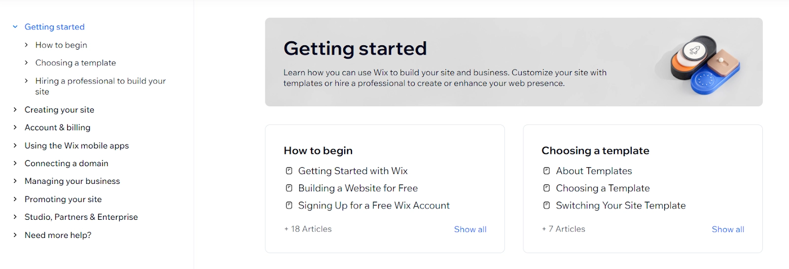
Here’s a great FAQ page example from Wix’s help center. They’ve segmented these FAQs based on how users will explore the product after signing up.
- Create a tiered information structure: After creating segments, you want to present these segments in a tiered structure to help users navigate to the right information quickly. You can create top-level tiers for the main categories and add sub-tiers within each category. For example, "Shipping" can be the main tier and "International Shipping" and "Shipment Tracking" can be two sub-tiers.
- Use question grouping: Listing too many questions together can easily overwhelm users. Instead, you can group similar or connected questions into a single knowledge base article and answer multiple FAQs in different sections of this article.
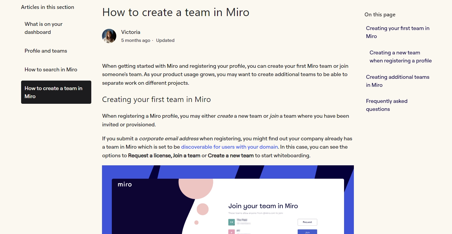
Here’s how Miro uses this technique with an “On this page” list on the right and “Articles in this section” on the left to tell users exactly what they can expect.
Your FAQ page’s structure can make a huge difference for end-users and simplify all the information you want to share.
📌 Related resource: FAQ Templates & Examples to Design a Winning FAQ Page
3. Write clear and concise answers
The true litmus test of your FAQ pages is how effortlessly users can understand your solutions. Do they get drawn into a rabbit hole of jargon and complicated words? Or is it quick as a wink to find a question and answer?
If you’re aiming for the latter, you have to tailor your answers to your users’ proficiency.
So, understand how familiar your audience is with a particular topic. Then, use the right language to communicate the necessary information instead of working with an ornamental vocabulary.
The best way to deliver instant gratification through your FAQ pages is to share a clear, straightforward and short answer right off the bat. Follow this up with a more contextual explanation and visual content.
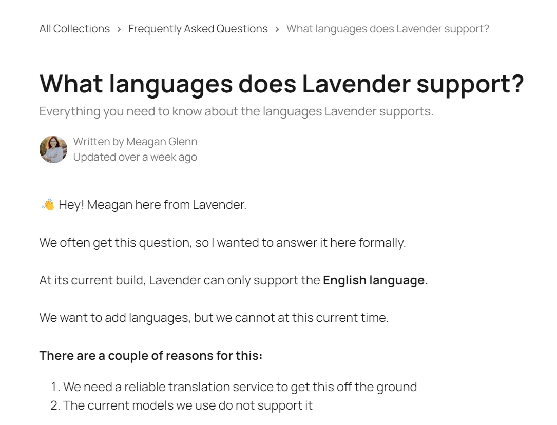
In this great FAQ page example by Lavender, the writer quickly introduces herself and proceeds to give you a straightforward answer in bold for this question. Then, she adds more context around this answer to address any follow-up concerns users might have.
You should also consider breaking down complex or lengthy answers into a step-by-step format. This is more scannable for users and easier to understand in a logical sequence.
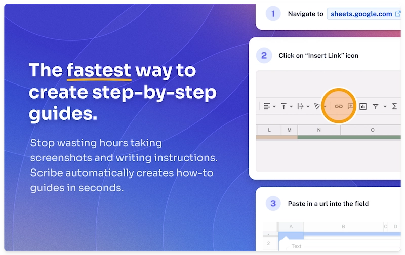
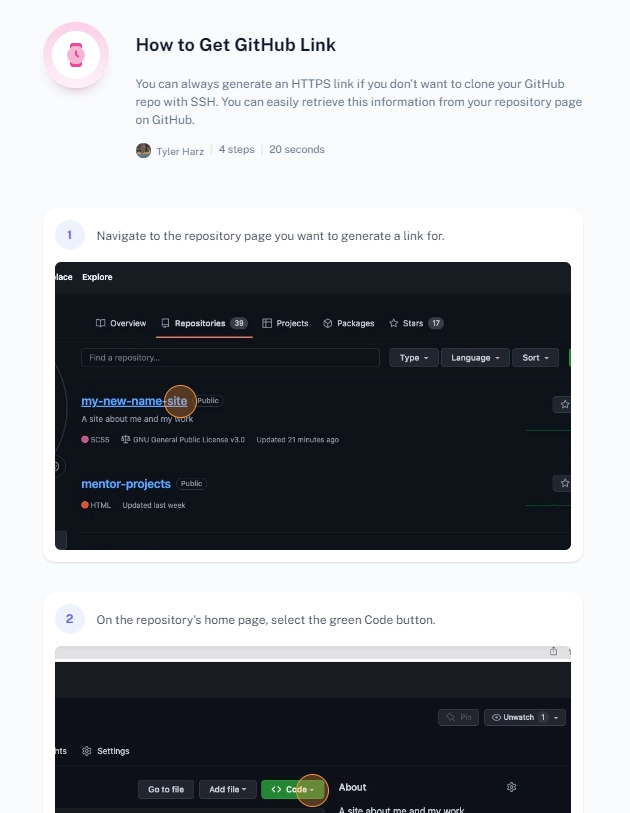
💡 Tip: Use an AI-powered tool like Scribe to save time! Scribe captures your screen as you work and auto-generates a step-by-step guide complete with screenshots and written text for each step.
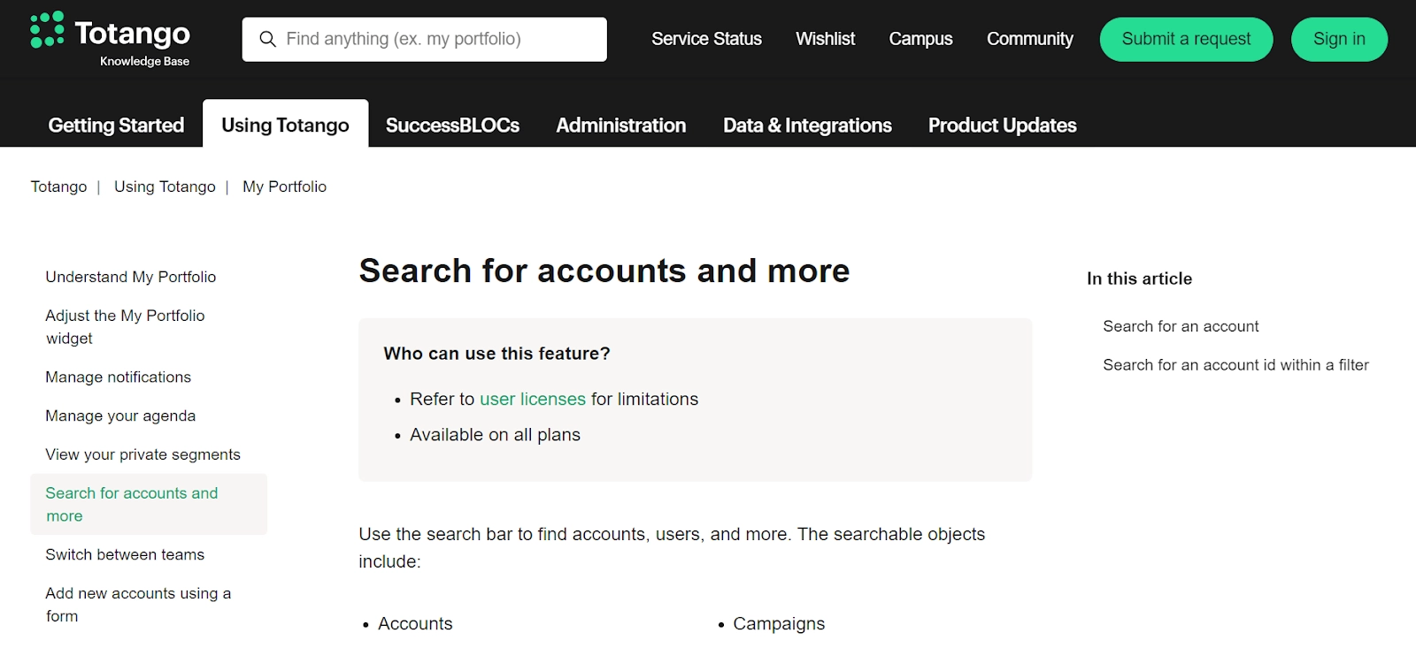
Besides, you can always link related articles to help users get more details on a topic without getting lost in a maze. Provide more contextual resources through sidebars and navigation panels, like in this example by Totango.
Users can easily switch between tabs on top to learn more about different aspects of the product. They can also use the navigation index on the left with all the articles within a tab or the search bar.
4. Focus on solutions, not just explanations
FAQs aren’t an excuse to write lengthy and confusing answers. If you want users to get value from these pages, you have to provide actionable solutions instead of simply explaining the problem.
Here’s a good and bad example to show the difference between a solution-centric and a problem-focused approach to writing FAQs:
❌ Our app may occasionally experience syncing issues due to server overload.
✅ If you face syncing issues, try restarting the app. If the problem persists, please clear your cache. Here’s how: [link to detailed instructions].
The key is to highlight the best solutions upfront and start your answer with the most critical action to take right away. You should also use solution-focused language to emphasize action. For example, use phrases like “To fix this issue ...”
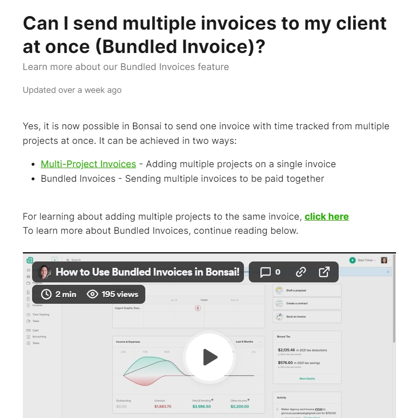
Consider this successful example of an FAQ document by Bonsai. The answer immediately tells you two ways to achieve the desired action. Then, you get a more detailed breakdown through an explainer video.
5. Use visuals and multimedia
Nobody wants to read big blocks of text. You can engage users better, capture their attention and maximize information retention by using visual content in your FAQ section. Graphics also make your answers relevant for visual learners.
Besides, visuals fast-track the troubleshooting process because users don’t have to spend time decoding textual instructions.
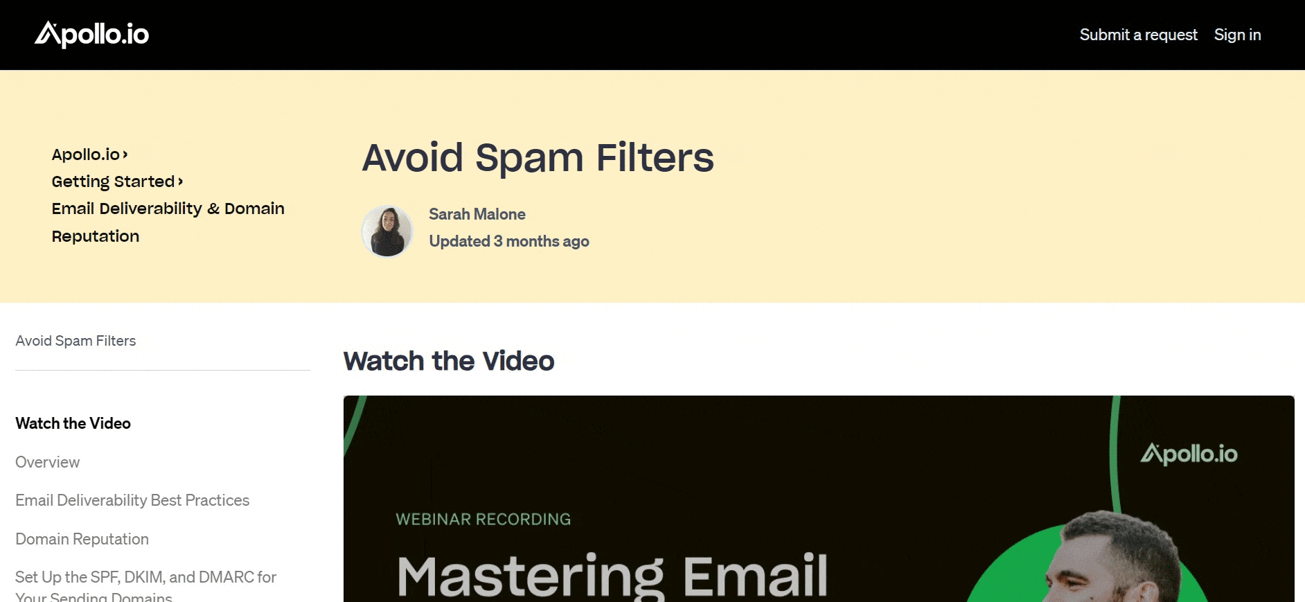
Check out how Apollo.io uses a video up top to answer user questions. The article also uses color-coded callout boxes and formatting to make the content easily readable.
But here’s the thing: creating an explainer video is a tedious job and taking hundreds of screenshots sounds like a nightmare. How else can you create visual content for FAQs? Easy—through Scribe.
Scribe helps you generate visually appealing step-by-step guides with annotated screenshots, text, clickmarks, keystrokes and more. Here's a Scribe in action:
With Scribe, you can:
- Capture any process or task with a simple screen recording.
- Customize guides using editing tools like blur, annotate, crop, merge and more.
- Track how users are interacting with these guides and collect their feedback.
- Curate multiple guides in a single place with Pages and share with a link.
Scribe makes it a cakewalk to share step-by-step instructions for any process or task. And the best part? You can update these guides in a snap by uploading new screenshots and adding/deleting steps. The guides will auto-update wherever they’re embedded or shared.
Lance, a UX designer, shares how game-changing Scribe has been for him and his team:
“We are thrilled that we found this solution. Scribe will enable us to quickly create new (and rework old) instructions for our many products. Additionally, we can improve how we onboard internal staff with step-by-step guides for our processes.”
6. Add a search bar
A search bar allows users to quickly find specific answers within your FAQ page, saving them time and frustration from scrolling through a long list of questions.
- Identify relevant keywords: Use keyword research tools or analyze user search queries to identify what users are looking for related to your product or service. Strategically incorporate relevant keywords into your questions and answers.
- Search engine optimization: Optimize your content for search engines by including relevant keywords naturally throughout the text.
Create FAQ pages to maximize customer delight
Great FAQ pages are more than a nice-to-have for modern businesses. Your customers don’t want to be bogged down by long and complicated ways to resolve issues. They need just-in-time support. That’s exactly what you can deliver with successful FAQ pages.
I’ve shared the complete recipe for how to write an FAQ page your customers will love. Now, it’s your time to shine. Sign up for Scribe to make beautiful FAQ guides with visual clarity and seamless user experience.


